
“Color creates, enhances, changes, reveals and established the mood of the painting.” By Kiff Holland
This quote is the perfect segue into the topic of tint maps. The painting in this case is the artwork called ultrasound. I write this blog from the vantage point of having several decades in this field. Tint maps always appealed to the artist in me.
Back in the mid 1980’s I took part in a research project at Mount Sinai Medical Center in Manhattan, New York under Dr. Martin Goldman. The familiar grayscale levels were instead displayed as a progression of yellows to reds corresponding to increasing temperature. The hypothesis was that diseases had different temperatures than normal tissue. Those temperatures would be color coded thereby adding to the diagnostic capability of the ultrasound exam.
There was another industry wide practice that was prevalent at this time. Most of us had B scanners or very rudimentary real time 2D scanners then. How we scanned was significant. We were in complete darkness. Dimmer switches did not exist in our exam rooms. There were no back lit keys or knobs on the ultrasound machines. This environment caused many sonographers to have visual issues.
The initial hypothesis was not proven true. Diseases did not have different temperatures. There was a great deal of fun changing the ultrasound images to different tint maps. The by-product of this and other research at the time proved that using tint maps prevents the early visual issues experienced by sonographers.
This is one reason we are using tint maps today.
It was difficult to pinpoint exactly when the term temperature maps changed to tint maps. The other term that refers to this technology is B color. Approximately 10-20 scholarly articles are reviewed for any article published by our institution. None addressed the change in terminology.
Why do ultrasound manufacturers still place them in all of our machines? While the look of the images is a personal preference, there is a credible body of research that points to the added diagnostic benefit of the tint maps
Tint maps commonly used in B flow and to Contrast modes, because the flow attributes can be mapped to a color family so that soft tissue can be distinguished from areas of moving flow. This creates more detailed information about the mass or the flow in a certain area.
There was one institution whose policy was, upon discovering a mass on the standard 2D that the sonographer would keep the image frozen and then change the tint maps and image the mass with different tint maps to better characterize the internal contents of the mass. From personal experience, it is true that changing a tint map will accentuate certain appearances. From radiologists to cardiologists this has been in greater practice and policy in the last seven years.
How are tint maps made? The same way that gray maps are made in the scan converter with signals that return from the body through the probe, so are tint maps. They are part of post processing. Tint maps are always applied after the echoes are compressed into the limited number of gray levels available. There is a wider range of echo levels received than can be displayed as many more shades of gray than can be seen by the eye, than can be displayed as shades of gray by the ultrasound machine. The same is true for tint maps. The compression used to assign and display gray maps are similar to those for tint maps. Values are assigned to weaker echoes and other values are assigned to stronger echoes. This is the function of mapping algorithms. The monitors might have the ability to display 6-8 bits red, 6-8 bits blue and 6-8 bits green and combine those to make different color hues. The mapping can be assigned to different color families. One family is blue, one is yellow to red and the other is green. The sepia color that is very popular with 2D, Doppler and M-mode is in the yellow to red family. Tint maps can be applied to M-Mode and the Doppler spectral waveforms. Tint maps are essentially superimposed onto the gray 2D image.
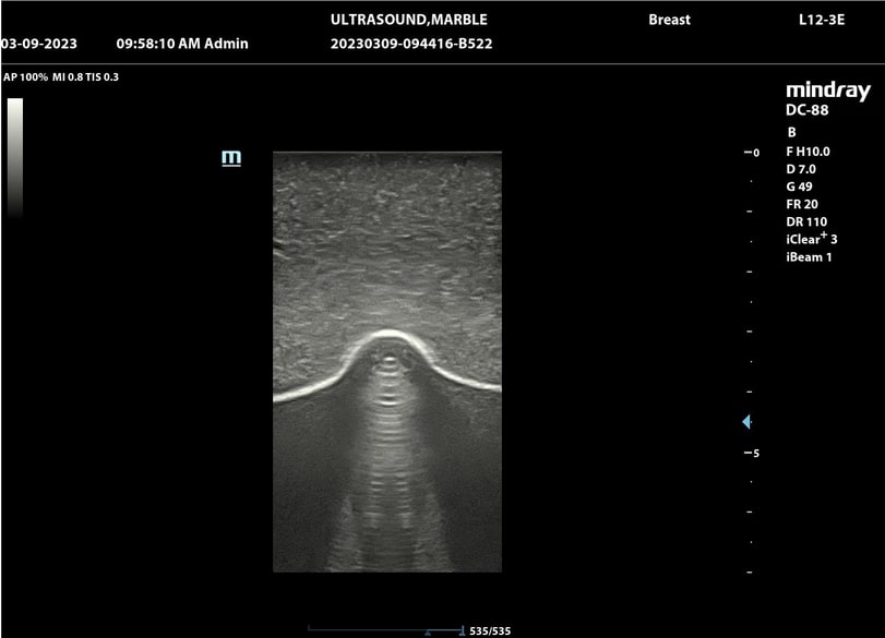
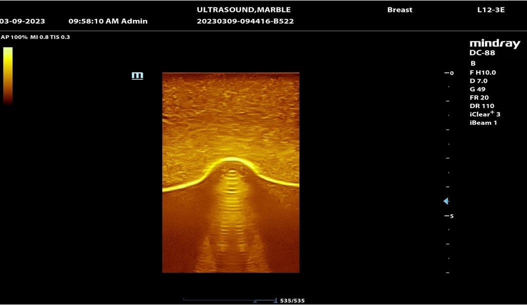
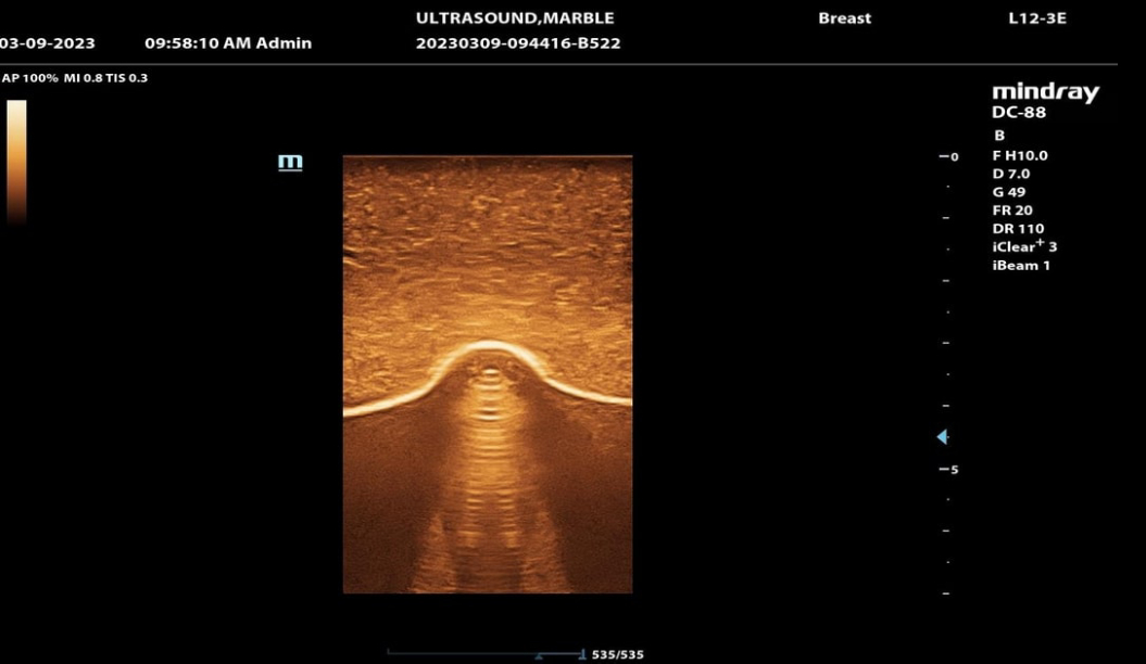
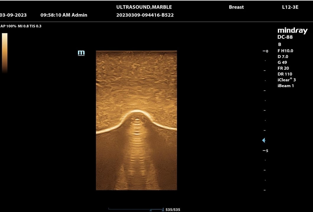
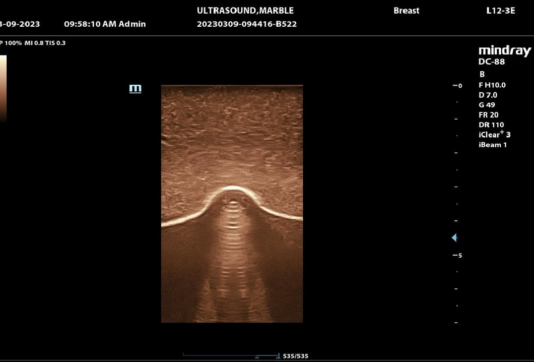
Look at the pictures we included below. The area of interest is at the bottom of the image. It is a marble placed under a tissue equivalent phantom. These images were performed on a Mindray DC88 with a L12-3E probe. All parameters were held the same and only the tint map was changed. What shape do you see?
If you have any questions regarding how to optimize your tint maps please call us 843-566-1020.
There was assistance in writing this article from Dr. Peter N. Burns 4/18/2023 12:00 est. University of Toronto
Reference
Siemens Patent filing Dr. Todd Willsie Application ID US 11/827,799, Submitted 2007 Published and approved 2011 USPTO.